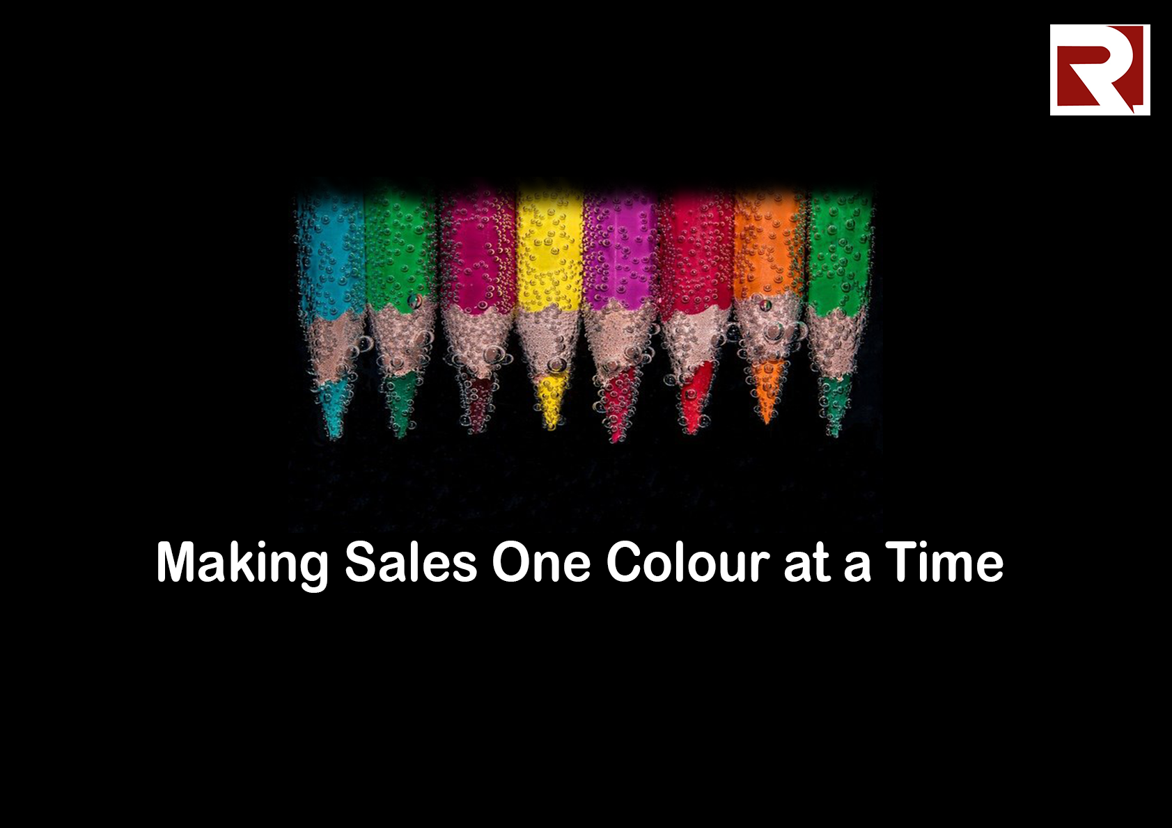
Your choice of colours speaks volumes about your business. With the right colours, customers can automatically connect with your business without yet going through your site. The right colours can engage people who stumble on your page long enough to decide to buy.
What does your colour say about you?
Businesses have long moved from the days of physical contact being the only option for sales exchange. Nowadays, people want to do it from the comfort of wherever they are, or the discomfort of it. But this new trend is not because humans don't want to connect. It is just for swiftness and convenience. Well, Introverts might argue otherwise. But the core remains that people want to connect with you, irrespective of the platform - physical or online. They want to feel welcomed, engaged, and comfortable.
Different people will be visiting your site/store. Some are patient enough to read, some are not. But an average online shopper wants as much information as they can get and don't mind a little fun while getting it. Studies have shown that consumers are more likely to buy an item because it is available in their preferred colours. It is the same for the design and interface. People are more likely to stay, engage, explore their options if the colours on the page tell them to.
Here are four things to consider when choosing your colours. This is in no particular order, so you are free to decide which comes first for you.
Your Brand
You have to consider your message and value as a brand -what do you want to communicate to people? Asides from your products and services, what else do you want customers to take home from you? Colour is a language everyone speaks. While everyone has their preferences, they understand what each colour means. Red is not my preferred colour, but I know when it is used to indicate danger. Your colours should have a lot to say about what you esteem as an organisation.
Your Customers
Who are your customers? What do they like? What do they respond to? How old are they? Are they B2B customers or B2C customers?
Every business has a defined target customer profile. You should consider them and what they respond to when choosing your colours. Choose colours that speak to them, colours that say more than the words you have all over your site/store. If you deal in Female Perfumes, you know what to do. Please don’t say Pink.
Your Product and Services
So I asked you not to say Pink. Why? Because it's perfume! Yes, Pink is considered feminine, but it doesn't resonate Fragrance to the mind, preferred colours or not. Choose colours that have something to say about your products and services. Green is a better colour choice for an agricultural firm. You can add a little yellow if you rent out farming equipment. Just pick colours that bring your products to mind.
Industry trend
Consider the colours that are associated with your industry. While this might not be true for every business, some industries have some colours that have become synonymous with them. It is okay to dare to be different. You don't have to conform to that norm. But be creative. Be different so you can stand out, not isolated or wired. It could even make first-time customers doubt your authenticity.
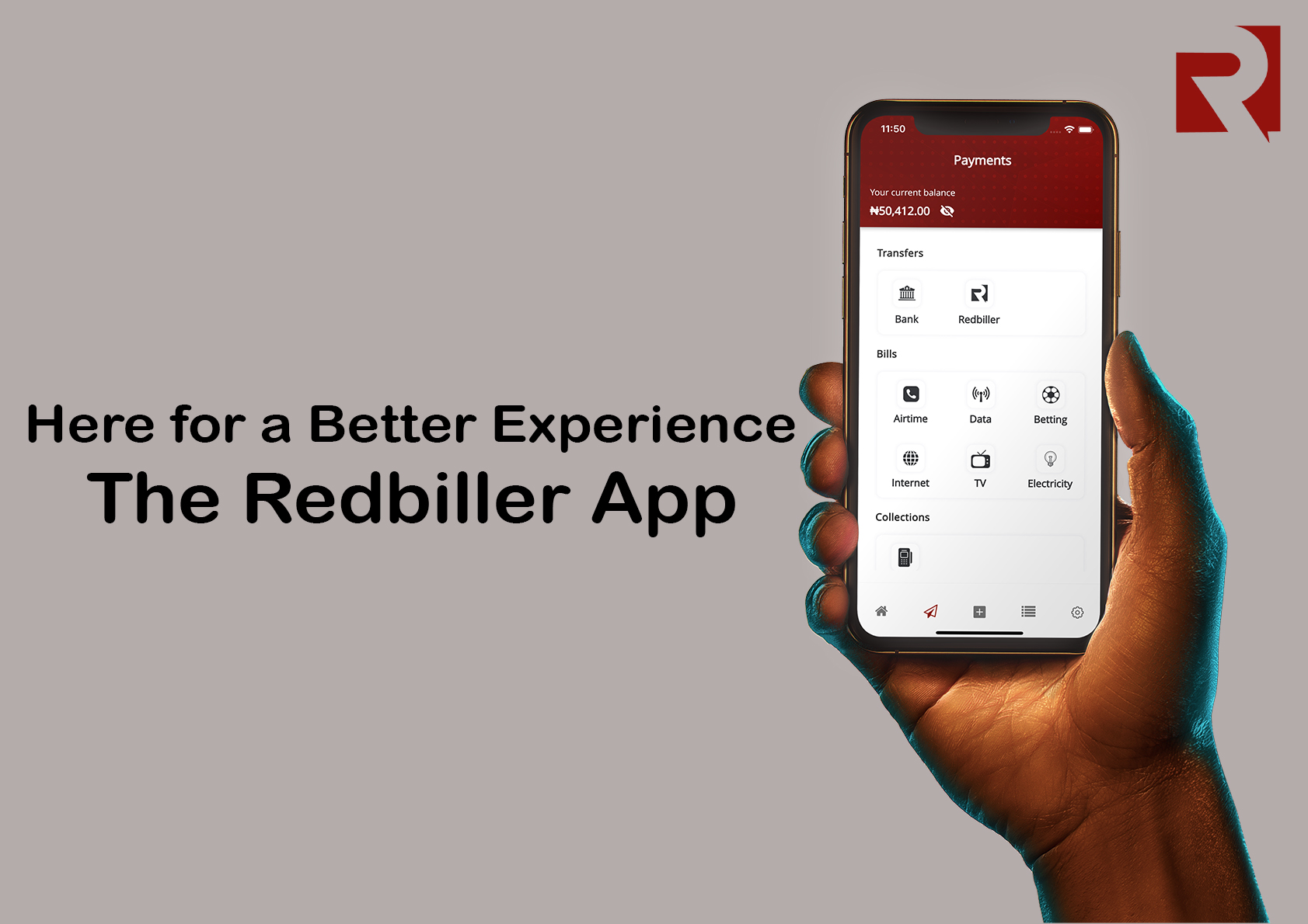
At Redbiller, we understand how important your colours are and the need to follow through with everything on your website to assure your customers. When you integrate with us, you can define your colours. You get to pick colours that blend with your website. You can also use the same checkout on multiple websites with different colours. And you get to adapt it to the colour of each website. This way your customers are not just making payment, but they are surrounded by the colours that speak you, your business, the colours they love.
You can learn more about our products and how they are tailored to cater for your business here -https://redbiller.com/products/checkout


